
Typeface One by One: Miller
Typeface One by One is a side project that was carried out by my friend, Lynn Lin and I. We wanted to practice using different typefaces or introducing the typefaces that we didn’t know or not familiar with to gain more knowledge about the huge world of typeface and typography. I think the relationship between typeface and a designer is really similar to ingredients and a chef: the more you know, the more chances you can deal with different situation by using different typefaces. So we hope that through sharing the posts not only we can bring more typeface knowledge and awareness to the public, but also get more chances to experience the expressions of various typefaces.
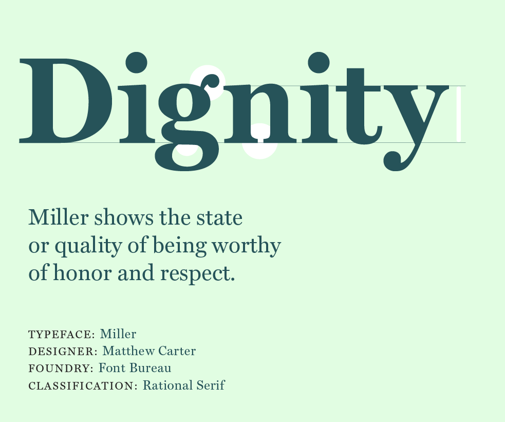
Today we want to introduce Miller
This typeface is designed based on Scottish Style Serif, which has influenced strongly by the Transitional Serif, so it’s really easy to notice that the features of Miller have both the character of old style humanist feel and the clean and clear modern sense. Released in 1997 by the type foundry, Font Bureau, Miller’s variety of style changes and its great flexibility of display size for different titles or headlines, soon beloved by the publication and news industries. Miller started to be seen in numerous magazines and newspapers which need a sense of dignity or gravitas and used its voice to tell a great story.
一日一字型
這是我跟我的好朋友發起的自主訓練,希望透過每天選用不同的字型來多認識一點這個龐大的字型世界。因為字型的使用對學習設計的人來說,就像是食材對上一個正在學習廚藝的學徒一樣,瞭解越多,在遇到不同的狀況下就能有更多彈性的運用。如果只使用習慣的幾個字型就會失去探索多樣性的趣味。我們希望,利用課餘的一點點時間,持續地上傳分享,用各自舒適的方式接觸新的字型,也透過分享去讓對字型有興趣的朋友也能感受一個字型無聲的情緒表達。還沒有想像這個自主訓練會變成什麼樣子,但是我們想先來試試看!希望你們也喜歡~
今天要介紹的是Miller
他是一個依照蘇格蘭風格(Scotch Roman)設計的字型,因為蘇格蘭風格的字型深受過渡時期(Transitional Serif)的襯線字體影響(例如大家可能聽過的字型:Baskerville)所以在感覺上也有一種古早書寫風跟現代俐落感融合的感覺。Miller在1997年的時候由Font Bureau發表,因為他豐富的樣式變化,還有在標題字體呈現上同時有成熟穩重的骨感,也有搶眼的曲線,所以開始受到新聞以及需要份量感的新聞類出版品親睞。下次想找個有尊嚴感的字體嗎風骨感強烈的Miller說不定是一個很不錯的選擇。